DAVID LOWRIE
Industry
Food and Drink
Action
Brand Positioning and Narrative, Visual Signage, Iconography and Visual Identity
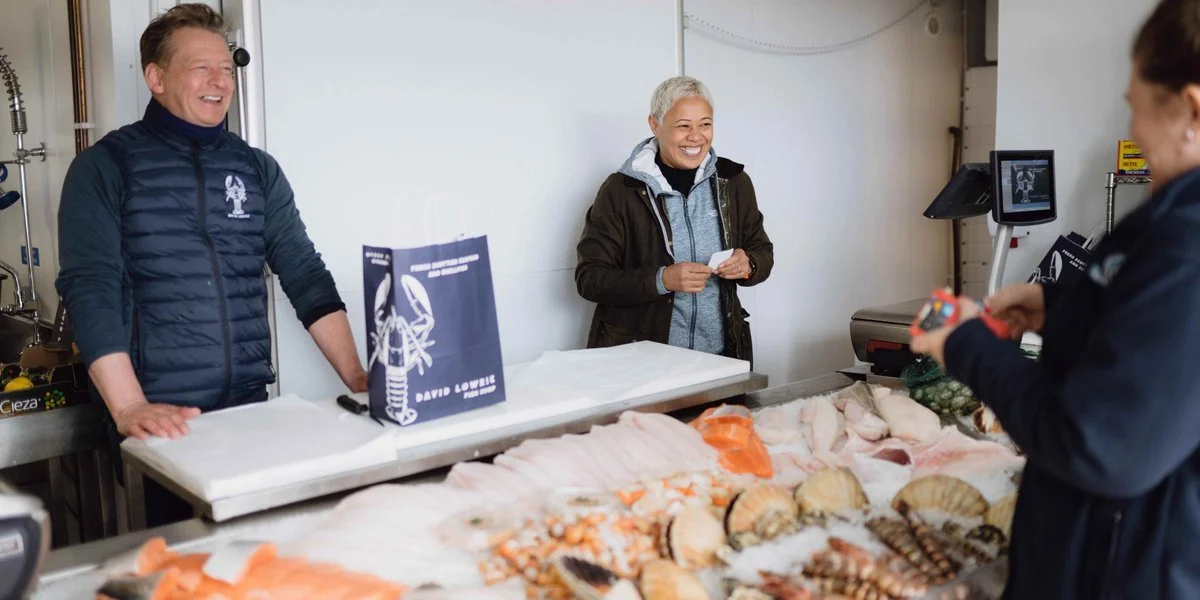
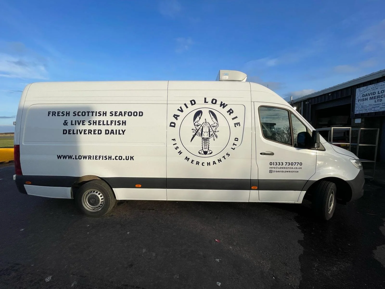
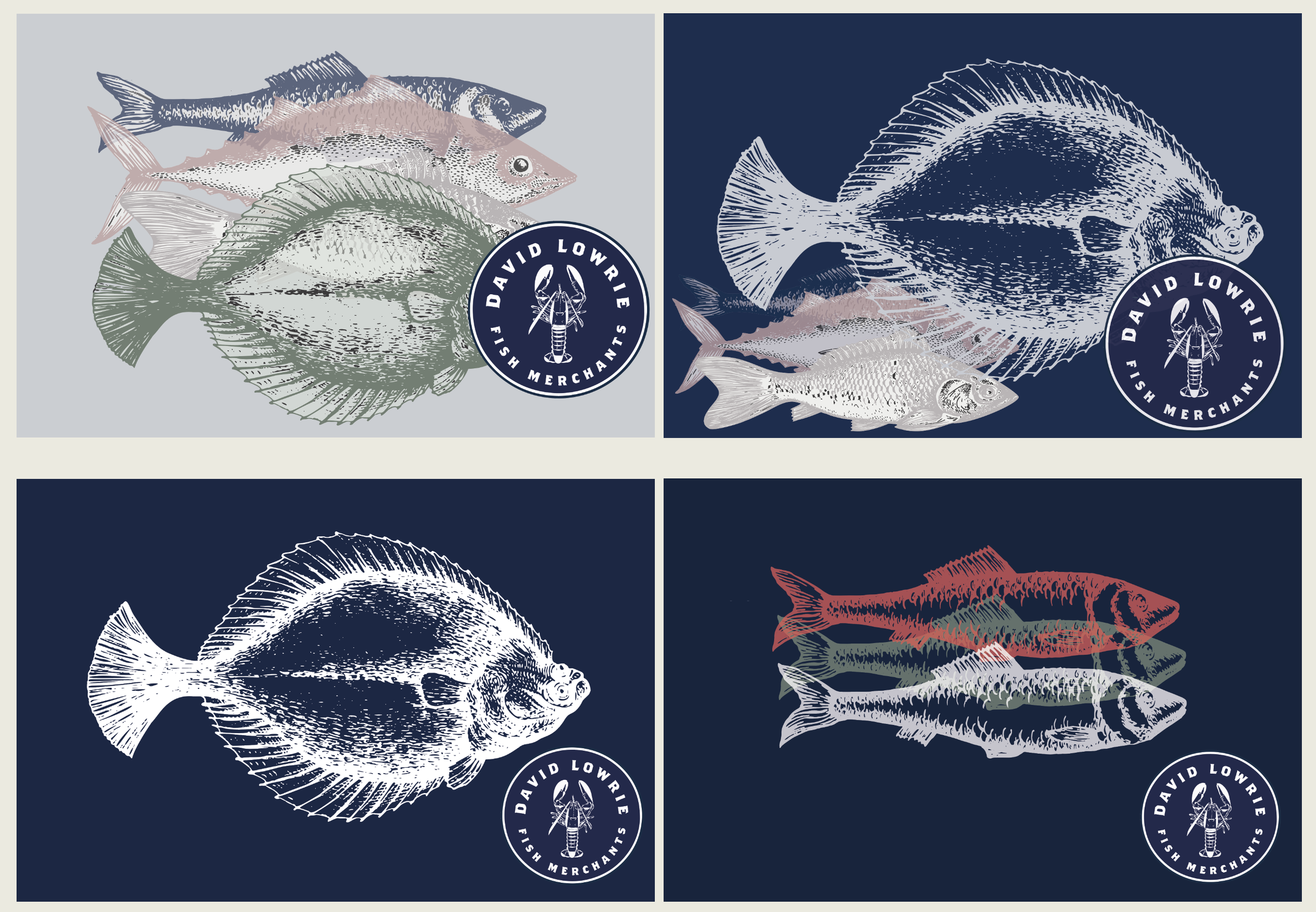
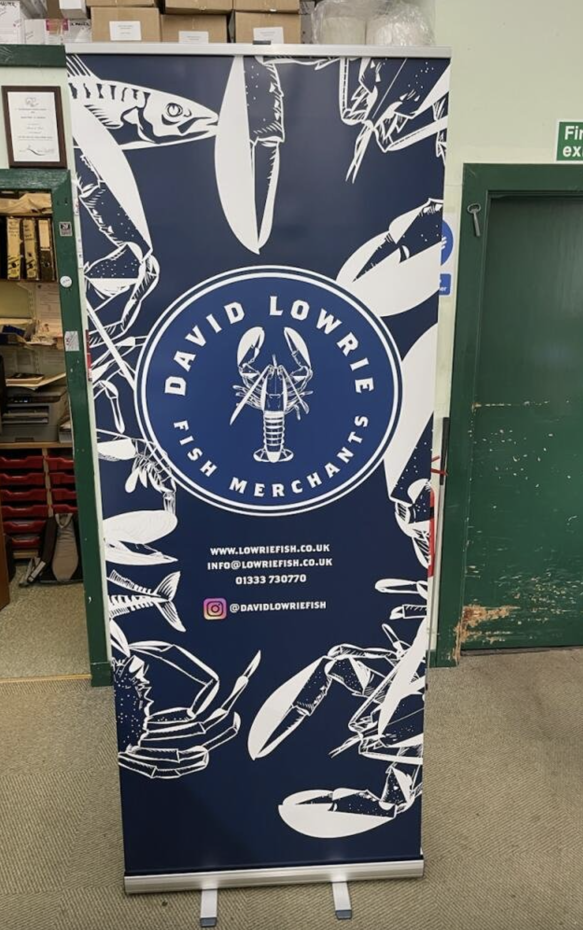
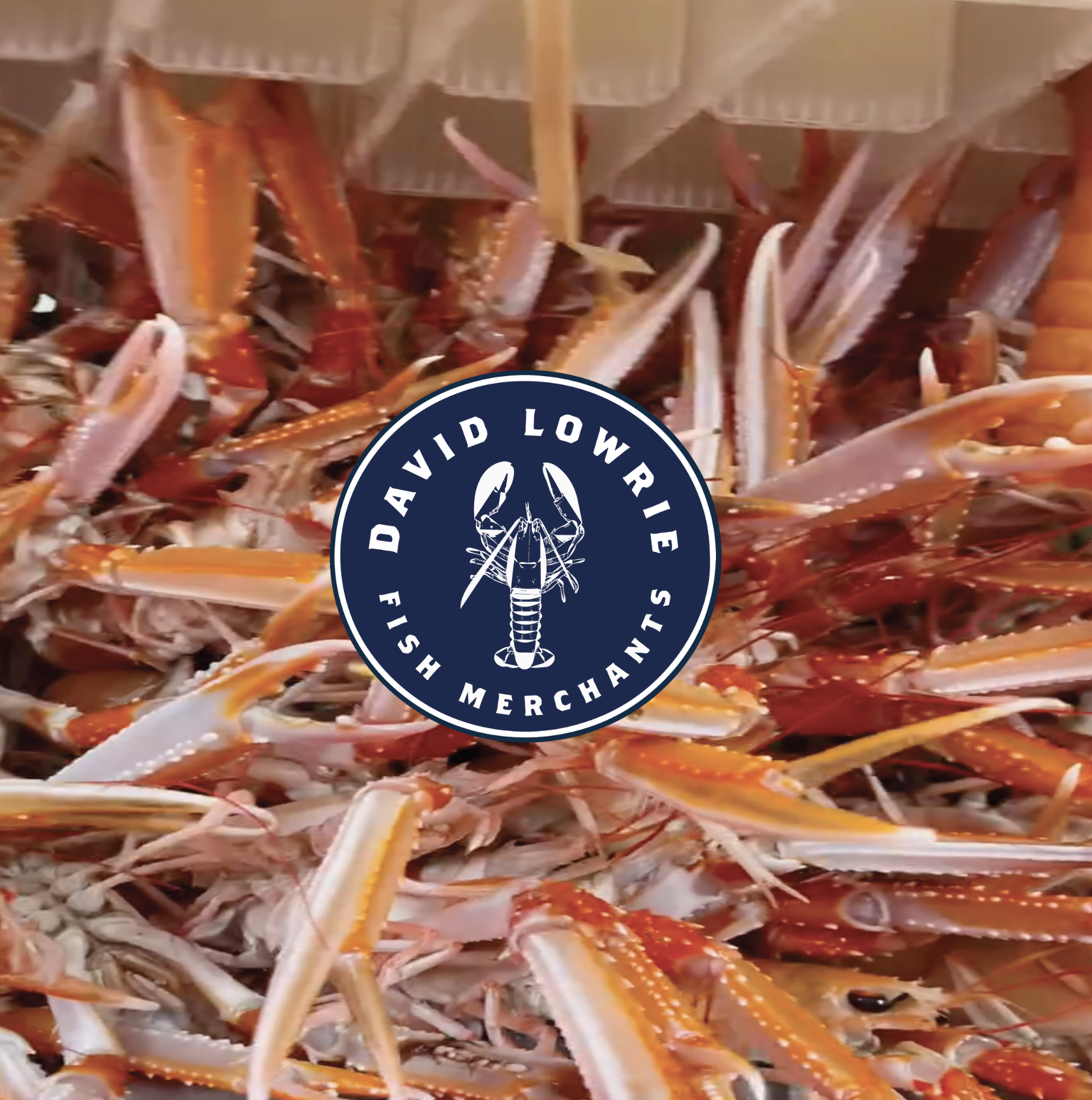
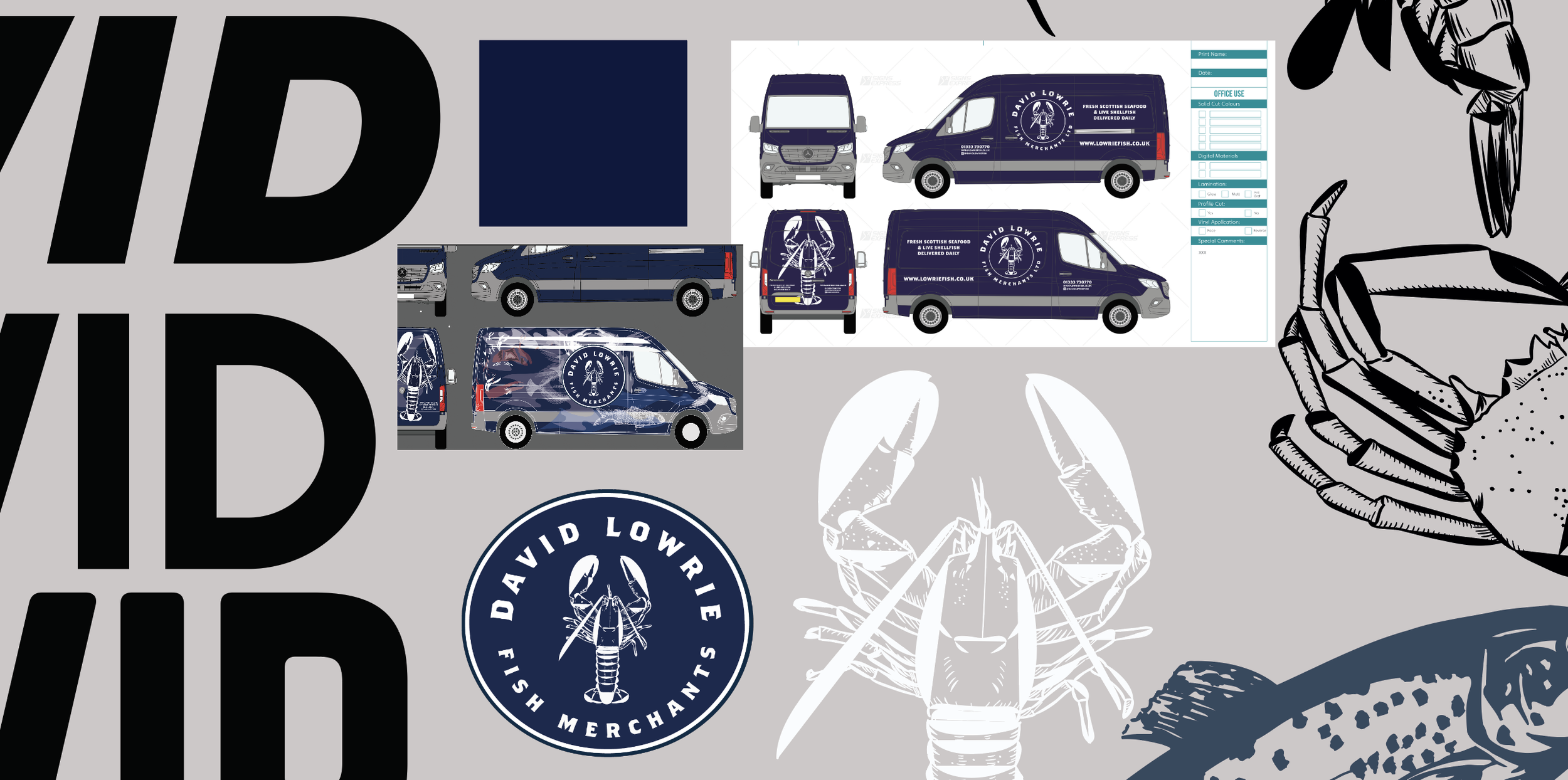
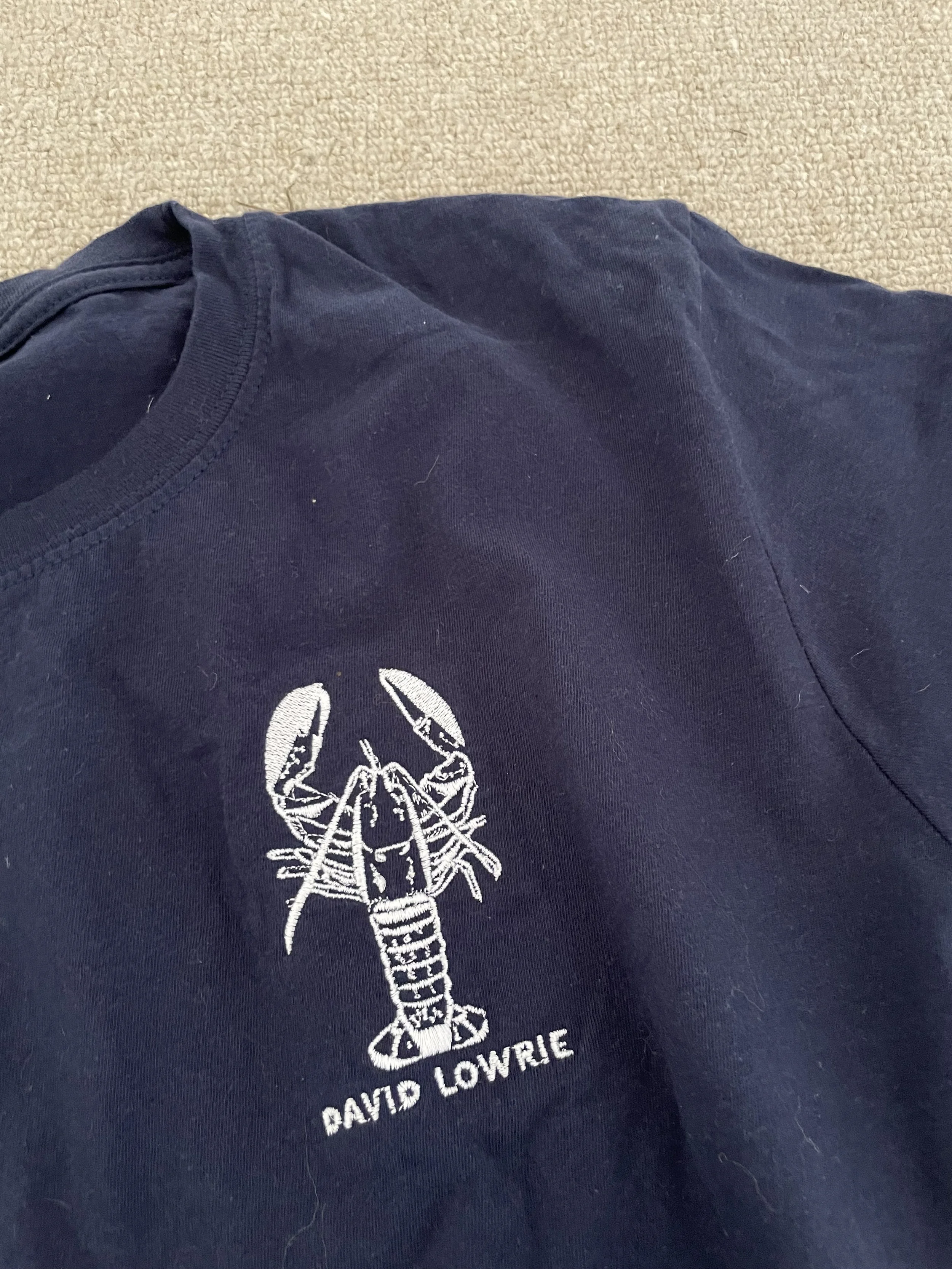
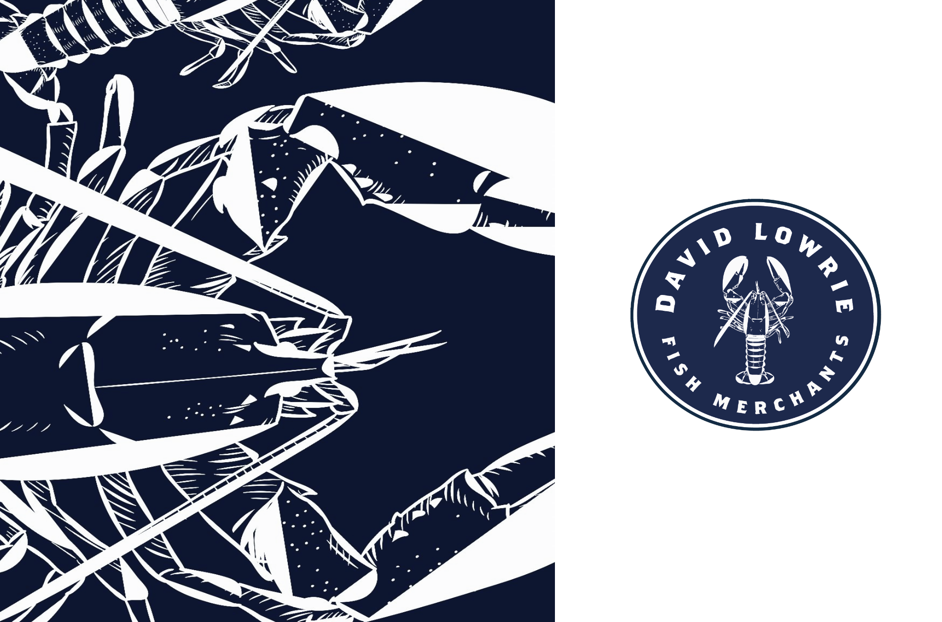
At the heart of the new identity is a visual system that handles duality. We created a lobster mark that acts as a seal of authority—not just a logo, but a stamp of quality for a 20kg crate of langoustines or a high-street carrier bag.
THE LOGIC:The orange mesh pattern acts as a rhythmic signifier, representing the geometry of the nets and the connectivity of a 3rd-generation family. The palette utilizes deep Atlantic hues met with a vibrant, morning-catch orange—a deliberate departure from generic seafood tropes toward premium heritage.
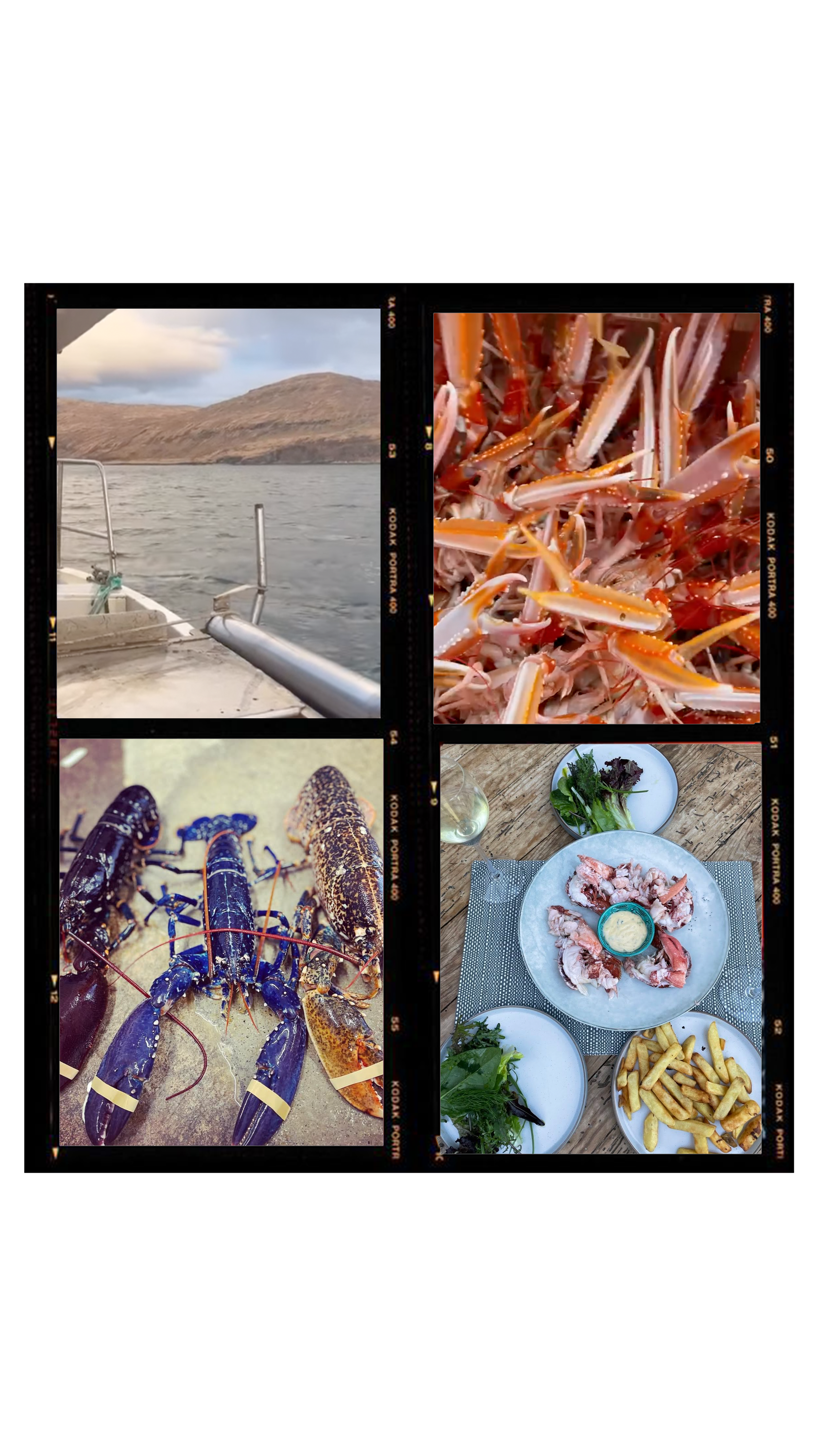
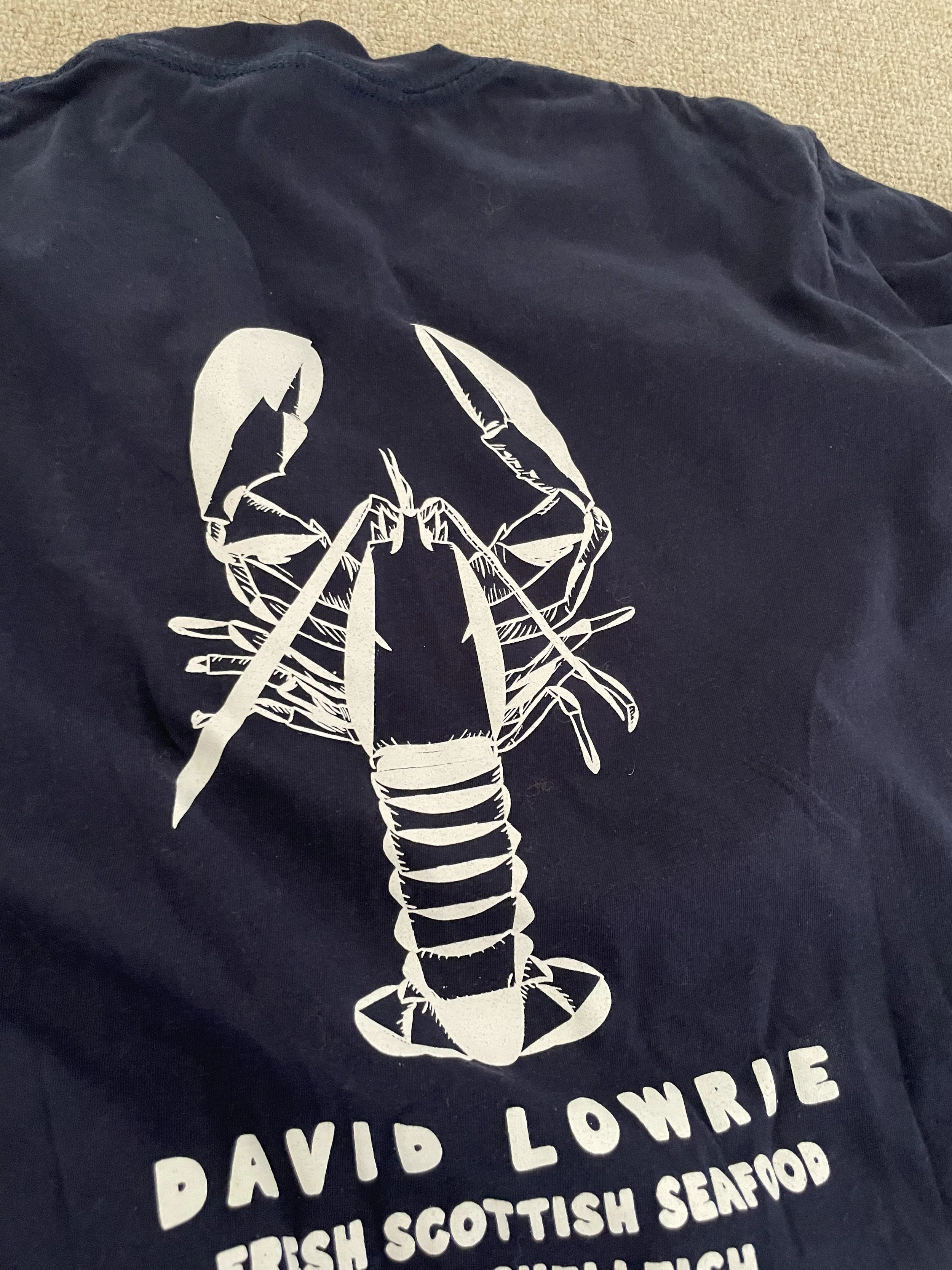
ATMOSPHERIC CUES: Beyond the mark, the brand is expressed through tactile materials—thick-stock butcher paper, high-contrast monochrome photography of the Fife coastline, and a verbal identity that is direct, honest, and unpretentious.
Every touchpoint was re-engineered to communicate provenance; from the clinical typography of wholesale invoices to the tactile, oversized graphics on the distribution fleet. The goal was to ensure that whether the brand appeared in a Michelin-starred kitchen or a local driveway, the signal of "elite craft" remained unbroken.
THE IMPACT: Since launching the new identity, David Lowrie has transitioned from a supplier to a destination, resulting in a 20% revenue growth and successful market expansion into signature restaurant ventures.